Writing Python Functions for Data Understanding
In this post, I’ll explain two Python functions: one that calculates key statistics for a dataset attribute and another that prepares data for visualization.
To ensure these functions work correctly, I will use unittest to create test cases and verify their functionality.
Table of contents
Part I. Data Understanding Overview
Context
Data Mining Pipeline involves:
- Data understanding
- Data pre-processing
- Data warehousing
- Data modeling
- Pattern evaluation
The first crucial step in the Data Mining Pipeline process is understanding the data.
In this step, we analyze the dataset to understand its quantitative objects and attributes, calculating central tendency and dispersion measures. Attributes can be categorical or numerical, impacting the statistics you can calculate.
- Numerical attributes are quantitative and can be measured on a scale.
- Categorical attributes represent categories or groups and are qualitative. Some statistics do not apply to these attributes or are used differently (i.e., number of objects, frequency count, mode, proportions, cross-tabulation).
Let’s define a function that returns the following attributes for the ith column:
- Number of objects: count()
- The minimum value: min()
- The maximum value: max()
- The mean value: mean()
- The standard deviation value: std()
- The Q1 value: quantile(0.25)
- The median value: median()
- The Q3 value: quantile(0.75)
- The IQR value: Q3 - Q1
Actions
- Import the required Python packages & libraries
# import required Python packages and libraries
import argparse
import pandas as pd
import numpy as np
import pickle
from pathlib import Path
- Define the function and return statistics on selected attributes.
# define the calculate function
def calculate(dataFile, col_num):
    """
    Input Parameters:
        dataFile: The dataset file.
        ithAttre: The ith attribute for which the various properties must be calculated.

    Default value of 0,infinity,-infinity are assigned to all the variables as required.
    """

    #Initialize the variables
    numObj, minValue, maxValue, mean, stdev, Q1, median, Q3, IQR = [0,"inf","-inf",0,0,0,0,0,0]

    #load the dataset
    data = pd.read_csv(dataFile)

    #select attribute
    attre_selection = data.iloc[:, col_num]

    # Get the column name
    column_name = data.columns[col_num]

    #calculate stats
    numObj = attre_selection.count()
    minValue = attre_selection.min()
    maxValue = attre_selection.max()
    mean =  attre_selection.mean()
    stdev =  attre_selection.std()
    Q1 = attre_selection.quantile(0.25)
    median = attre_selection.median()
    Q3 = attre_selection.quantile(0.75)
    IQR = Q3 - Q1


    #return results
    return column_name, numObj, minValue, maxValue, mean, stdev, Q1, median, Q3, IQR
If you wish to print the results using a f-string:
    # Print the results with their respective labels
    print(f"Count: {numObj}")
    print(f"Min: {minValue}")
    print(f"Max: {maxValue}")
    print(f"Mean: {mean}")
    print(f"Standard Deviation: {stdev}")
    print(f"Q1: {Q1}")
    print(f"Median: {median}")
    print(f"Q3: {Q3}")
    print(f"IQR: {IQR}")
Results
When executing this function, various statistics are calculated and returned:
- numObj: The number of non-null values in the column.
- minValue: The minimum value in the column.
- maxValue: the maximum value in the column.
- mean: The mean/average value of the column.
- stdev: The standard deviation measures the amount of variation or dispersion of values.
- Q1: The first quartile (25th percentile)
- Median: The 50th percentile represents the middle value of the dataset.
- Q3: The 3rd quartile (75th percentile).
- IQR: The Interquartile Range (Q3-Q1), which measures the spread of the middle 50% of the data.
Tests
- Run tests using unittest
The unittest library is a built-in Python library for writing and running tests on your code. It provides a framework to create unit tests, which are small and focused tests designed to check if individual pieces of your code (such as functions and methods) work correctly.
# import required Python packages and libraries
import unittest

# define the test cases/assertions
class TestKnn(unittest.TestCase):
    def setUp(self):
        self.loc = "/Data_Mining/pipeline_data/dataset.csv"
        file = open('/Data_Mining/pipeline_data/testing', 'rb')
        self.data = pickle.load(file)
        file.close()

    def test0(self):
        """
        Test the label counter
        """
        self.column = self.data[0]
        result = calculate(self.loc,self.column)
        self.assertEqual(result[0],self.data[1][0])
        self.assertAlmostEqual(result[1],self.data[1][1], places = 3)
        self.assertAlmostEqual(result[2],self.data[1][2], places = 3)
        self.assertAlmostEqual(result[3],self.data[1][3], places = 3)
        self.assertAlmostEqual(result[4],self.data[1][4], places = 3)
        self.assertAlmostEqual(result[5],self.data[1][5], places = 3)
        self.assertAlmostEqual(result[6],self.data[1][6], places = 3)
        self.assertAlmostEqual(result[7],self.data[1][7], places = 3)
        self.assertAlmostEqual(result[8],self.data[1][8], places = 3)

tests = TestKnn()
tests_to_run = unittest.TestLoader().loadTestsFromModule(tests)
unittest.TextTestRunner().run(tests_to_run)
Tests returned 0 errors and 0 failures, indicating that the functions above were defined correctly.
unittest.runner.TextTestResult run=1 errors=0 failures=0
Part II. Data Visualization Overview
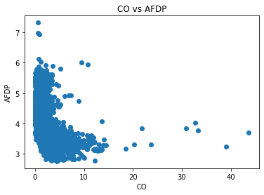
Data visualization can be very powerful in assisting in data understanding. Data Visualization Methods include boxplots, histograms, scatterplots, quantile plots, heatmaps, etc. Let’s define a function that helps generate a scatter plot.
Context
Having a function to extract the necessary data for plotting can simplify the process of gathering and preparing data for visualization and allow for the reuse of the function without having to rewrite the data extraction and preparation code. The function below streamlines the process of creating a plot.
Actions
- Import Python packages and libraries
import pandas as pd
import numpy as np
import matplotlib.pyplot as plt
- Define the function to return:
- x: data for the x-axis
- y: data for the y-axis
- title: the title of the plot
- x_label: label for the x-axis
- y_label: label for the y-axis
def func():

    '''
        Output: x, y, title, x-label, y-label
    '''

    #initialize variables
    x = []
    y = []
    title = ''
    x_label = ''
    y_label = ''

    #load the dataset
    data = pd.read_csv('/Data_Mining/pipeline_data/dataset.csv')

    # Extract x and y values
    x = data['CO'].tolist()
    y = data['AFDP'].tolist()

    # Define Titles and Labels
    title = 'CO vs AFDP'
    x_label = 'CO'
    y_label = 'AFDP'

    return x, y, title, x_label, y_label
Results
The function returns x, y, title, x_label, y_label values and makes them available for plotting.
Tests
By running this cell, we see the scatter plot image based on the function we defined.
from IPython.display import Image, display
# Display the image with a custom-size
display(Image(filename='/Data_Mining/pipeline_data/scatter_plot.png', width=300, height=200))

We can then compare the output of our function and validate the function is working properly.
# Testing the func() function
x, y, title, x_label, y_label = func()
plt.scatter(x, y)
plt.title(title)
plt.xlabel(x_label)
plt.ylabel(y_label)